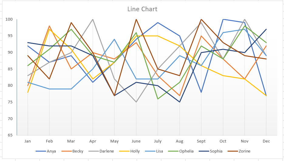
Using charts and images, data visualization, clearly and efficiently communicates data. But when you’re trying to visualize statistics for several items, your chart can be anything but clear and hardly efficient to read. In this example, I’ve created a line chart depicting the monthly score for eight different people. While you can pick out obvious high or low performance, there’s not a whole lot of information being communicated here.
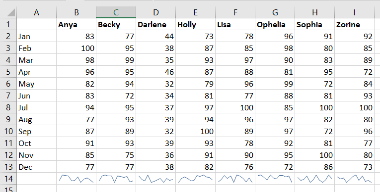
Did you know Excel can create mini-charts, known as “sparklines” to visualize individual statistics and compare statistics across items? Select the data that you want to compare. From the Insert ribbon bar, look for the “Sparklines” section. I am going to use a “line” style sparkline.
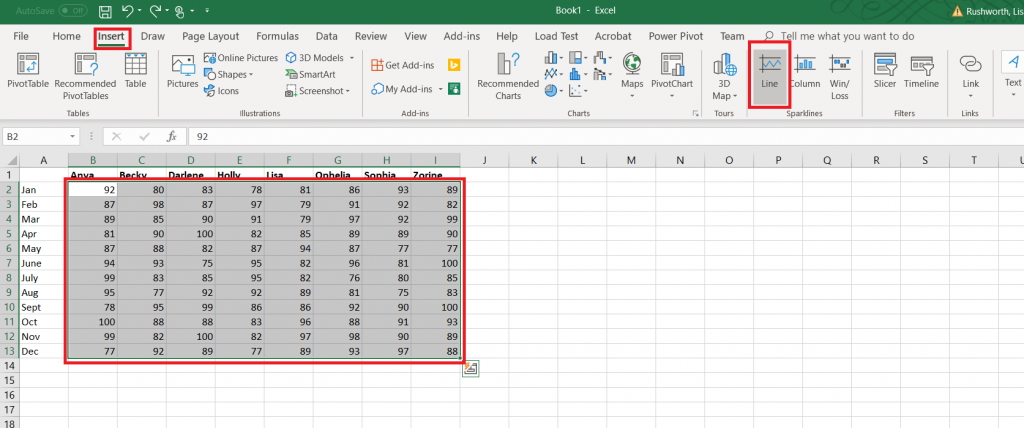
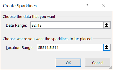
The data range will be selected. Enter the range where you want the mini-charts to display – this can be the row under your data or the column next to your data, or it can be some completely different location.
By default, the y-axis range for each mini-chart depends on the values of the data contained in the chart. This makes comparing the charts a little difficult – the scale is different. In the example below, scores in the 30’s don’t look different than scores in the 80’s.
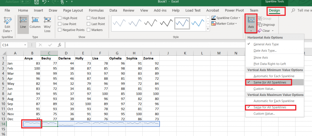
Click on one of the mini-charts, and a “Design” tab will appear on the ribbon bar. Select it. Under “Axis”, change the minimum and maximum values to “Same for All Sparklines”.
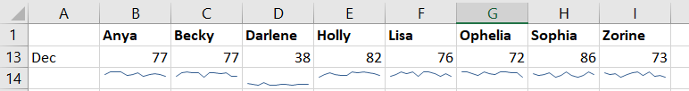
Now you can see how individual performance varied as well as compare individuals.
Blank values will show up as broken lines in the mini-charts. If you do not want to display a gap, return to the “Design” ribbon bar and select “Edit data”. Select “Hidden & Empty Cells”
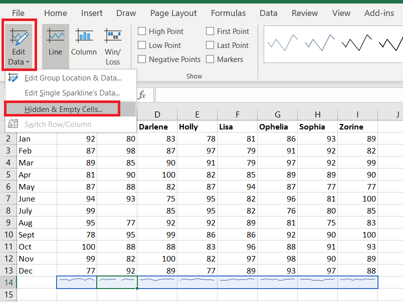
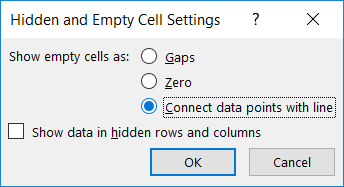
Select what you want instead of gaps – you can treat null values as zero or have a line drawn between the values on either side of the missing value.