Tag: data analysis

Understanding Exponential Growth

Using the data from https://covidtracking.com/data/national/cases: in the most recent seven day span (10-16 November), 1,056,346 people in the US have been infected with this coronavirus. The total number of cases yesterday was 11,047,064. That means 9.562% of the *total cases* in the US were new cases in the past week.


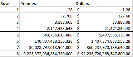
This is how exponential growth works — and why you heard a lot about ‘flattening the curve’ earlier in the year. If you put a penny on the first square of a chess board, double it and put two pennies on the second square, double it and put four pennies on the third square, and continue in that fashion … mathematically, you have 2^n pennies on each square, where n is the numeric sequence of the square, 0-63. On the last square in the first row, square #7, there are 2^7 pennies — 128 pennies, or a buck and twenty eight cents. Not a lot. And the end of the second row, you have 2^15 pennies — 32,768 pennies. That’s $327.68 — over three hundred bucks. A lot more than a buck, but not a huge amount of money. But you’re up to 2^23 at the end of the third row — 8,388,608 pennies or $83,886.08. Eighty three grand is a lot of money. By the time you get to the mid-point on the board, the end of the fourth row, you have 2^31 pennies on a square. 2,147,483,648 pennies for $21,474,836.48 — over twenty million dollars. A lot of money, but it’s possible. The second half of the chessboard is where exponential growth becomes unsustainable. The end of the fifth row is 2^39 — 549,755,813,888 pennies. The end of the sixth row is 2^47 — 140,737,488,355,328 pennies. The end of the seventh row is 2^55 —  On the final square, you have 2^63 … 9,223,372,036,854,775,808 pennies for $92,233,720,368,547,758.08 … 92 quadrillion dollars. If the going price of Earth is only five quadrillion dollars, you’re putting a marker for the entire solar system (and then some) on that last square.

And that ignores the accumulating total — while you have 92 quadrillion dollars on the final square, you have another 92 quadrillion dollars on the entire rest of the board. Now, obviously, we are not doubling our rate of infections every day. But we’re entering “second half of the board” territory just the same.

Actual Data – On What Is SNAP Money Spent?

Turns out there is actual data (not complete, as it does not account for non-SNAP cash purchases … but how many people pay cash at the grocery store?) regarding what groceries people buy with SNAP and what groceries they buy otherwise. Here.

And I get the compassionate argument that I shouldn’t dictate what someone can and cannot purchase just because they happen to have fallen on hard times. That’s a bit like saying you cannot be irked when a friend asks to borrow a couple hundred bucks to make rent and you then encounter the same friend buying a new couture handbag / stereo system / whatever floats their boat. You can! And probably are. Because it’s one thing to blow your own money on whatever you want, it’s quite another to tell me you need help at the same time. So, yeah, I want food bought with SNAP funds to be better than that on which an average American spends their grocery money.

And … kind of surprising … it might be. Either way, #1 is meat/poultry/seafood (not a vegan’s view of healthy, but not guaranteed to be junk food). SNAP folks? #2 is veggies, 3 is cheese, 4 is fruits. Crap starts to show up as #5 (soda and stuff) and 6 (desserts). Frozen prepared foods, 8, are generally unhealthy. For the non-SNAP baskets: soda is #4, frozen prepared foods #4, and prepared desserts #5. Welfare queen stereotype aside, it turns out SNAP recipients do allocate more of their funds to non-junk categories than average American shoppers.

But there’s better and there’s well.  I don’t think it’s right for two billion dollars in tax money to go toward SNAP purchases of sweetened beverages. And another two billion for prepared desserts. That’s eight BILLION dollars in one YEAR toward obvious junk if we concede people believe bottled water, fruit juices, and coffee/tea are essentials. Up to 9.7 billion if those are included as well.

SNAP recipient purchases:

Rank Category $ in millions % of expenditures
1 Meat, Poultry and Seafood $5,016.30 15.92%
2 Vegetables $2,873.90 9.12%
3 High Fat Dairy/Cheese $2,483.20 7.88%
4 Fruits $2,271.20 7.21%
5 Sweetened Beverages $2,238.80 7.10%
6 Prepared Desserts $2,021.20 6.41%
7 Bread and Crackers $1,978.20 6.28%
8 Frozen Prepared Foods $1,592.30 5.05%
9 Milk $1,211.00 3.84%
10 Salty Snacks $969.70 3.08%


Non-SNAP purchases – Top 10:

Rank Category $ in millions % of expenditures
1 Meat, Poultry and Seafood $1,262.90 19.19%
2 Sweetened Beverages $608.70 9.25%
3 Vegetables $473.40 7.19%
4 Frozen Prepared Foods $455.20 6.92%
5 Prepared Desserts $453.80 6.90%
6 High Fat Dairy/Cheese $427.80 6.50%
7 Bread and Crackers $354.90 5.39%
8 Fruits $308.20 4.68%
9 Milk $232.70 3.54%
10 Salty Snacks $225.60 3.43%


Breaking into the data farther, either group’s #1 fruit expenditure? Orange juice. Sigh! #1 vegetable expenditure? Potatoes.